How does the color and transparency of cosmetic jars influence consumer perception and product appeal?
Jan 18, 2025
The color and transparency of cosmetic jars are not merely aesthetic choices; they play a significant role in shaping consumer perception, influencing purchasing decisions, and enhancing the overall appeal of beauty products. In an industry where presentation is often just as important as the product itself, the way a cosmetic jar is designed can make a lasting impact on how a consumer interacts with and perceives the brand. From the first glance on a store shelf to the feel of a product in hand, these visual elements contribute to the consumer experience in ways that go beyond simple packaging.
Color is one of the most powerful tools in product packaging. It is known to evoke emotional responses and convey subtle messages that can align with a brand's identity or the specific characteristics of the product inside. For example, pastel colors such as soft pinks, blues, or greens are often associated with gentle, soothing skincare products, such as moisturizers or serums. These colors convey a sense of calmness, purity, and comfort, encouraging consumers to view the product as nurturing and delicate. On the other hand, vibrant colors like deep red, gold, or black are commonly used for luxury cosmetics, suggesting elegance, opulence, and high-quality ingredients. This contrast in color can help create a distinct identity for a product within a crowded marketplace.
The choice of color also has practical implications for product perception. Certain shades can create an association with natural, organic, or eco-friendly formulations. For example, green and brown hues are often used to convey a sense of earthiness and sustainability, reflecting the growing consumer demand for clean and environmentally conscious beauty products. Similarly, soft white or beige tones are frequently used for products that emphasize simplicity, minimalism, and purity. In contrast, metallic finishes like silver, gold, or rose gold are commonly chosen to convey a premium, high-end image, often seen with luxury skincare lines or exclusive beauty products.
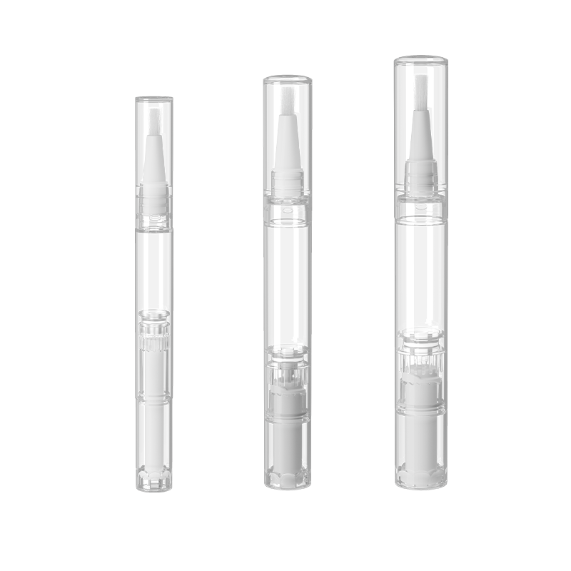
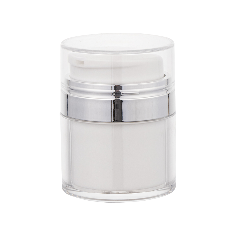
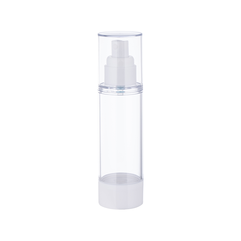
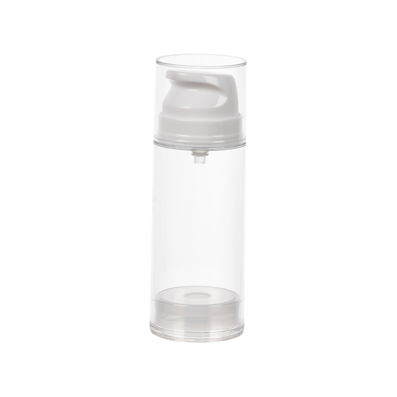
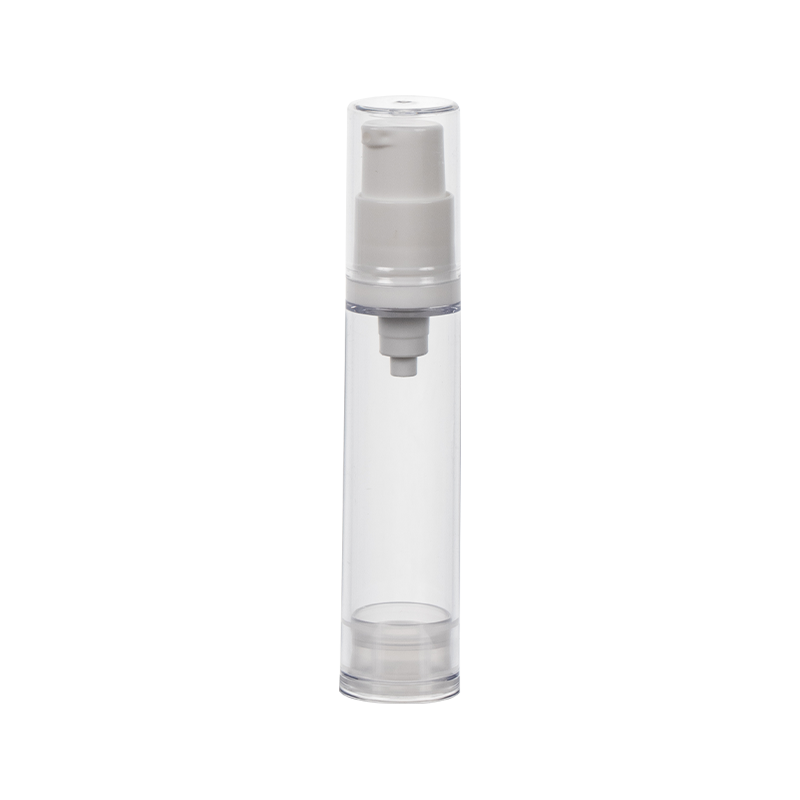
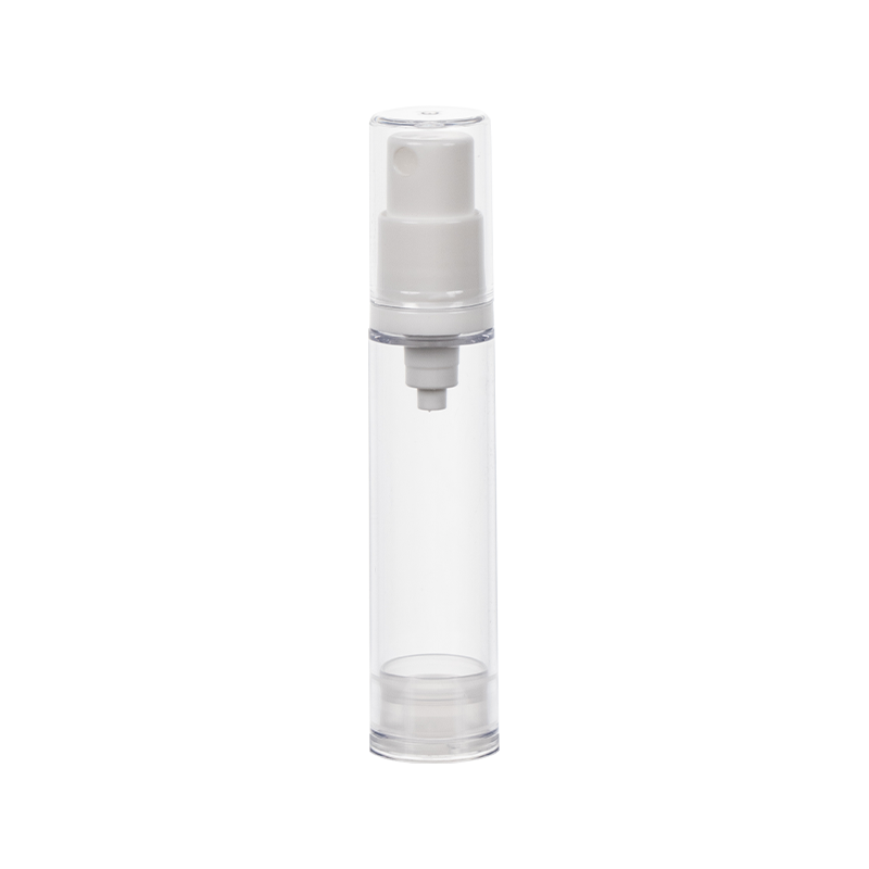
Transparency, or the level of clarity in a cosmetic jar, is another crucial factor in how a product is perceived. Transparent or clear jars allow consumers to see the actual contents of the product, which can significantly influence their perception of its quality. When a jar is clear, it provides a sense of transparency—not just in the physical sense, but also in terms of the product’s integrity. Consumers are more likely to trust a product when they can see what they are purchasing, especially if it’s a high-quality formulation. For skincare products such as creams, lotions, or oils, a clear jar can showcase the consistency, texture, and color of the product, which can be a deciding factor in whether the consumer feels confident in their purchase.
Moreover, clear cosmetic jars allow brands to showcase their product's appearance and create an inviting visual experience. A well-made cream with a luxurious, rich texture, or a product with vibrant colors, can be beautifully displayed through a transparent jar, creating a sense of luxury or efficacy. This visual appeal can encourage consumers to feel that they are purchasing a high-quality product, often leading to an emotional connection with the brand.
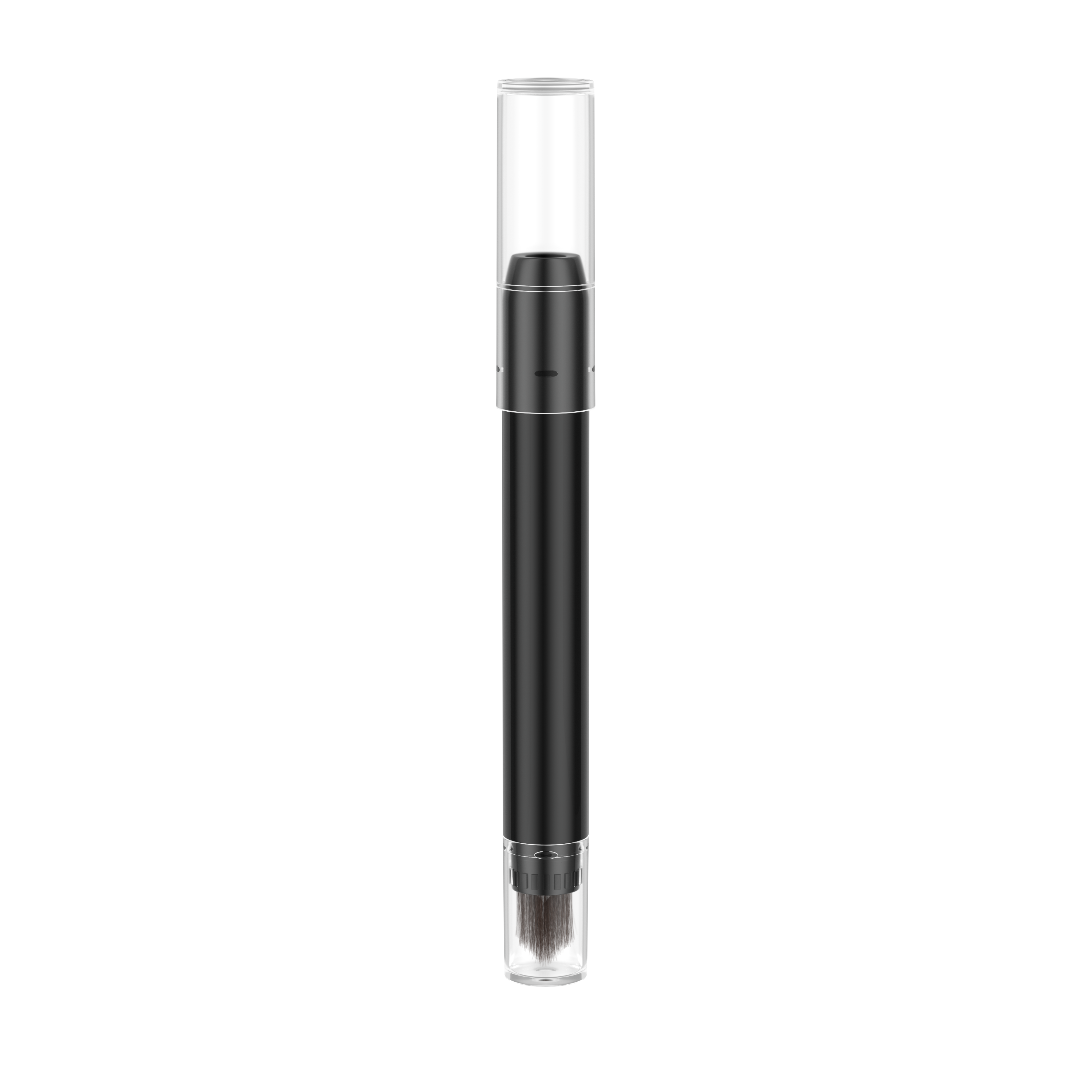
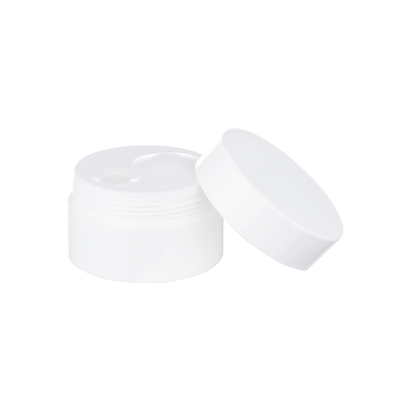
However, not all products are best suited to transparent packaging. For certain skincare formulas, particularly those with sensitive ingredients like antioxidants or vitamins, opaque jars may be preferred. The opacity of the jar can protect the contents from exposure to light, which can degrade the efficacy of certain active ingredients. In this case, the color of the jar becomes an important consideration for maintaining product stability. Darker hues, such as amber or opaque white, are often chosen for products that require protection from UV rays, ensuring that the formula retains its potency over time.
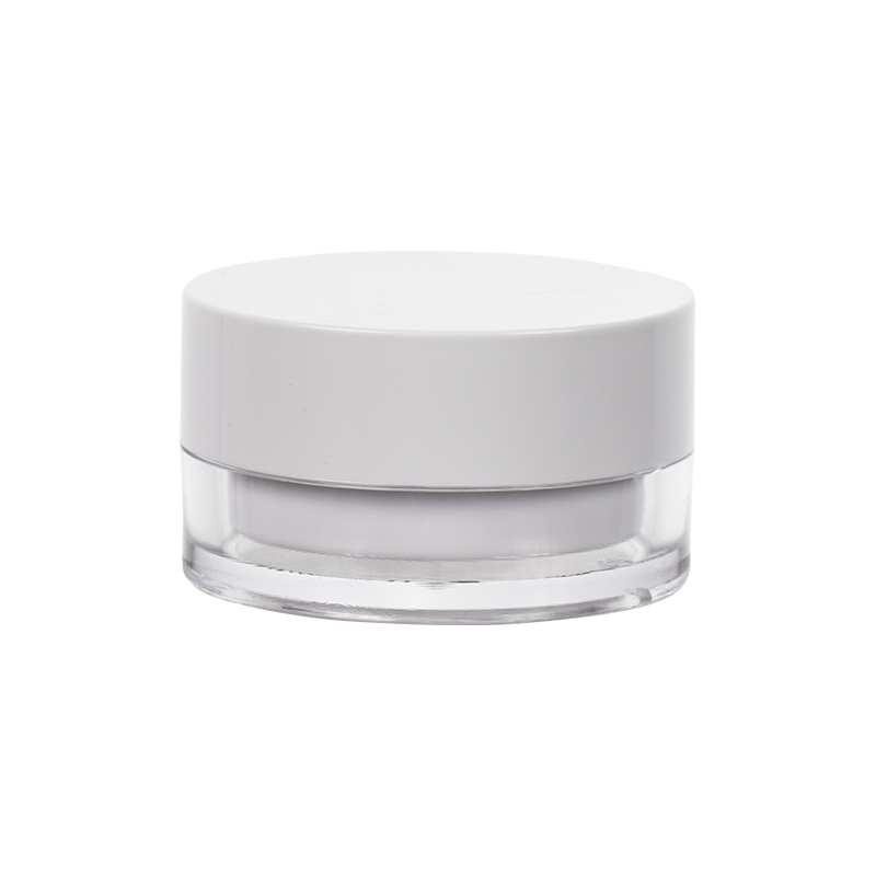
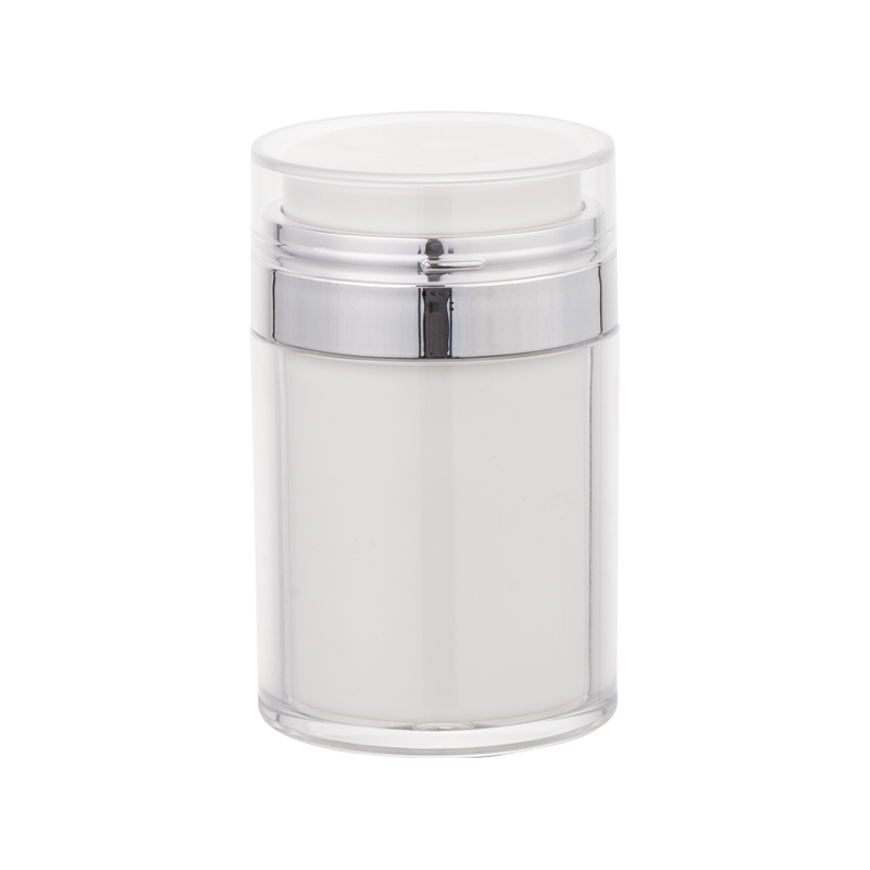
The design of the cosmetic jar can also speak to the exclusivity or premium nature of a product. For instance, a clear jar with a sleek, modern design can evoke a sense of purity and sophistication, while a frosted jar may add a layer of elegance and refinement. Some cosmetic brands use colors and transparency in conjunction with texture—such as matte finishes or glossy sheens—to enhance the tactile and visual appeal of the packaging. These design choices allow brands to differentiate themselves in a competitive market by creating packaging that is not only functional but also a part of the overall brand experience.
Furthermore, color and transparency can also influence the perceived value of the product. For instance, a cosmetic jar with a vibrant color and sleek, clear design might appear more luxurious and worth a higher price point, while a basic, transparent jar may be seen as more affordable or straightforward. These visual cues directly correlate to how consumers are willing to position a product within their purchasing hierarchy. In a world where consumers are bombarded with endless choices, first impressions matter—and often, packaging is the first point of contact.
The color and transparency of a cosmetic jar are not just about enhancing the aesthetic appeal of a product but also about reinforcing the brand’s messaging and aligning with consumer expectations. These visual cues influence everything from brand perception to product functionality and consumer trust. The right color and level of transparency can make a product stand out on the shelf, create an emotional connection with the buyer, and enhance the product’s overall appeal. As the beauty industry continues to evolve, packaging design will remain a key element in determining how consumers engage with a brand and how effectively that brand communicates its identity.


 English
 中文简体
中文简体